Flex는 레이아웃 배치 전용 기능을 가지고 있습니다.
IE에서도 표준 속성을 지원합니다.
(Flex 기능 별 지원 브라우저 현황 : https://caniuse.com/#feat=flexbox)
Can I use... Support tables for HTML5, CSS3, etc
About "Can I use" provides up-to-date browser support tables for support of front-end web technologies on desktop and mobile web browsers. The site was built and is maintained by Alexis Deveria, with occasional updates provided by the web development commu
caniuse.com
* Flex layout은 부모(Container)와 자식(Item) 관계로 이루어져 있음
* 부모와 자식 간 적용할 수 있는 속성이 나누어져 있다.
* 부모에 display: flex로 flex 속성을 적용
<sytle>
	.flex-container{
    	display: flex;
    }
</style>
* display : flex / inline-flex
- div 내용만큼 자리를 차지함
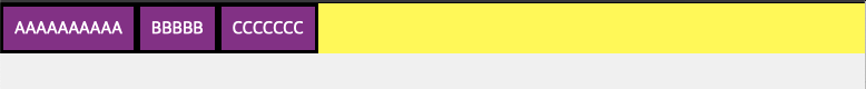

- 화면이 줄어들어도 한 라인에 표시
- flex 속성 지정하지 않은 경우
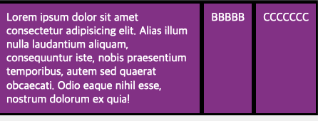
* flex-wrap : wrap / nowrap / wrap-reverse
- item 요소의 내용이 화면보다 길 때, 어떻게 처리할지 결정
- wrap : 마지막 요소부터 아래로 줄바꿈 처리
- nowrap : 줄바꿈 처리하지 않고 화면에 보이지 않게 함
- wrap-reverse: 마지막 요소부터 위로 줄 바꿈 처리
- wrap

- nowrap
- wrap-reverse
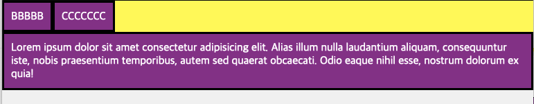
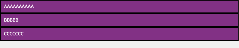
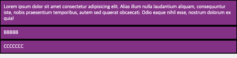
* flex-direction : row(default) / column / row-reverse / column-reverse
- flex item 요소들의 정렬 방향을 선택할 수 있다. main-axis의 위치가 바뀜
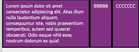
- column
- row-reverse

출처 : 1분 코딩 https://studiomeal.com/archives/197
이번에야말로 CSS Flex를 익혀보자
이 튜토리얼은 “차세대 CSS 레이아웃” 시리즈의 첫번째 포스트입니다. 이번에야말로 CSS Flex를 익혀보자 이번에야말로 CSS Grid를 익혀보자 벌써부터 스크롤의 압박이 느껴지고,‘좀 편안하게 누
studiomeal.com